PHOTOSHOPILLUSTRATORPROCREATEWake ‘N’ Bakery Cafe Brand ReDesign
Wake ‘N’ Bakery is a cafe and shop situated just 10 miles northwest of the Mount Baker Summit in Glacier, Washington. Wake ‘N’ Bakery prides itself on homemade goods and the promotion of local businesses within the cafe - I wanted to emphasis these values through the hand-wrought style of each identity mark.
PRIMARY WORD MARK
Hand wrought and Weird!
The primary word mark for my redesign of Wake ‘N’ Bakery café is inspired by linocut stamps. I wanted to make each letter form feel weird and different but still in the same universe of each other.Additionally, I wanted to add eyes and texture to the type in the word mark to incorporate the “weird” side that Wake ‘N’ Bakery prides itself on.
SECONDARY MARKS
I aimed to make Wake ‘n’ Bakery Cafe more suitable for its fun and artsy audience. I decided to create secondary icons which can be used within coffee packaging to define different flavors of coffee the bakery would sell.
These icons are inspired by motifs related to the cafés location in Glacier WA, The products they sell as well as the morning - birds and sunrises.
BRAND COLORSHANDMADE CUSTOM TYPEIdeation Process and Target Audience
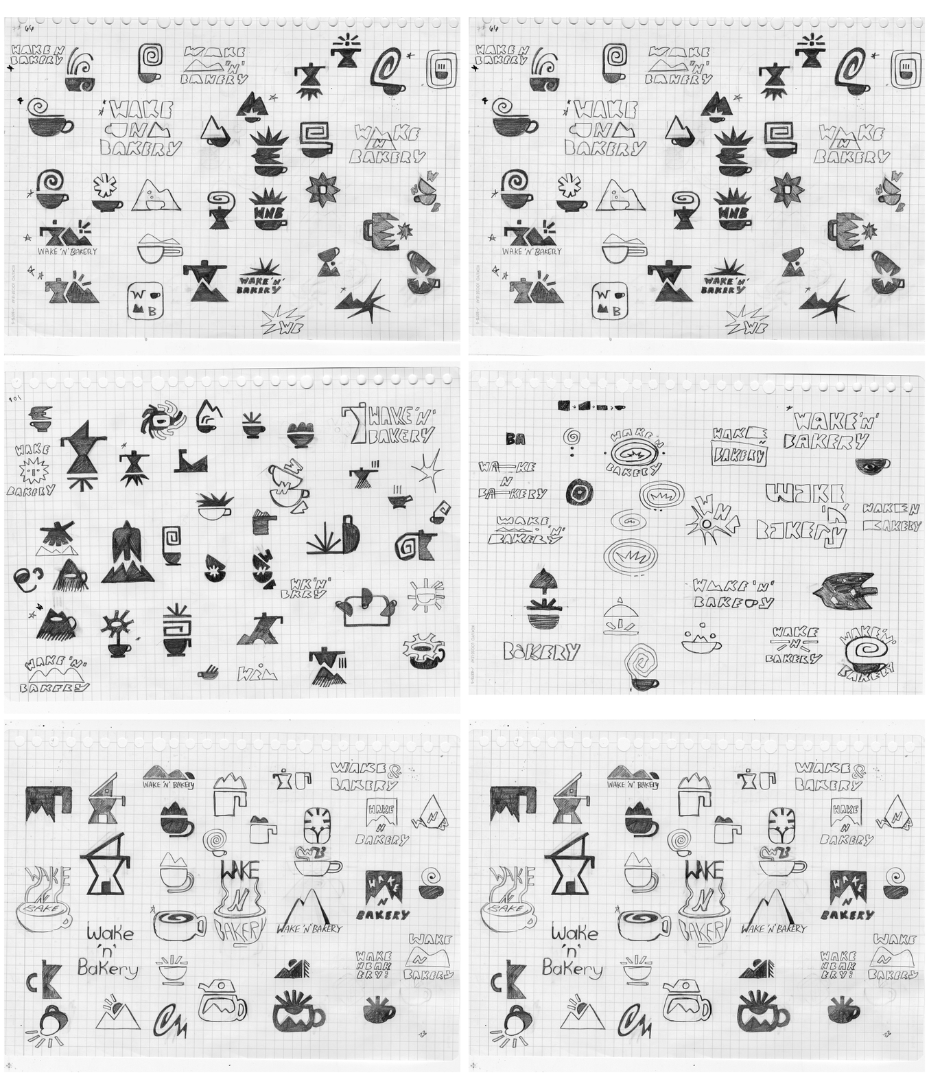
A compilation of 100 rough sketches I created of potential ideas for logo marks, identity marks and word marks.
Each logo was inspired by the simple stamps and and crafted pottery - this was done through simple geometric shapes repersenting different concepts.


